TidyTuesday: My 4-Hour Challenge
Apr 3, 2018 00:00 · 1421 words · 7 minute read
In the first quarter of 2018, I focused my data science education on expanding my R programming skills and setting up this blog in Hugo. I developed my first R package, an API wrapper to the U.S. National Provider Identification (NPI) registry, and created an R-powered Power BI custom visual for a client.
Although I still plan to continue my work on these projects, I’m ready to start a new challenge. In my consulting work, I do a fair amount of data wrangling with SQL and visualization in Power BI. I’m eager to improve my skills in these areas in R, particularly since I learned most of what I know about R in grad school, before the modern tidyverse era.
The Challenge
Enter the #TidyTuesday challenge, a weekly data wrangling and visualization challenge organized by the energetic and inspiring R for Data Science (R4DS) online learning community, which I joined a few weeks ago. The challenge is to remake a visualization based on a publicly available dataset that has been cleaned up but not tidied. For more information about this challenge, check out the TidyTuesday GitHub repo.
This week, I’m limiting myself to spending only 4 hours on the TidyTuesday challenge, including writing and publishing this post. As time allows, I’ll refine the product and post the follow-up result. I’m doing this partly because I have other important commitments (hello family and full-time job!), but also because it creates conditions that are closer to real life.
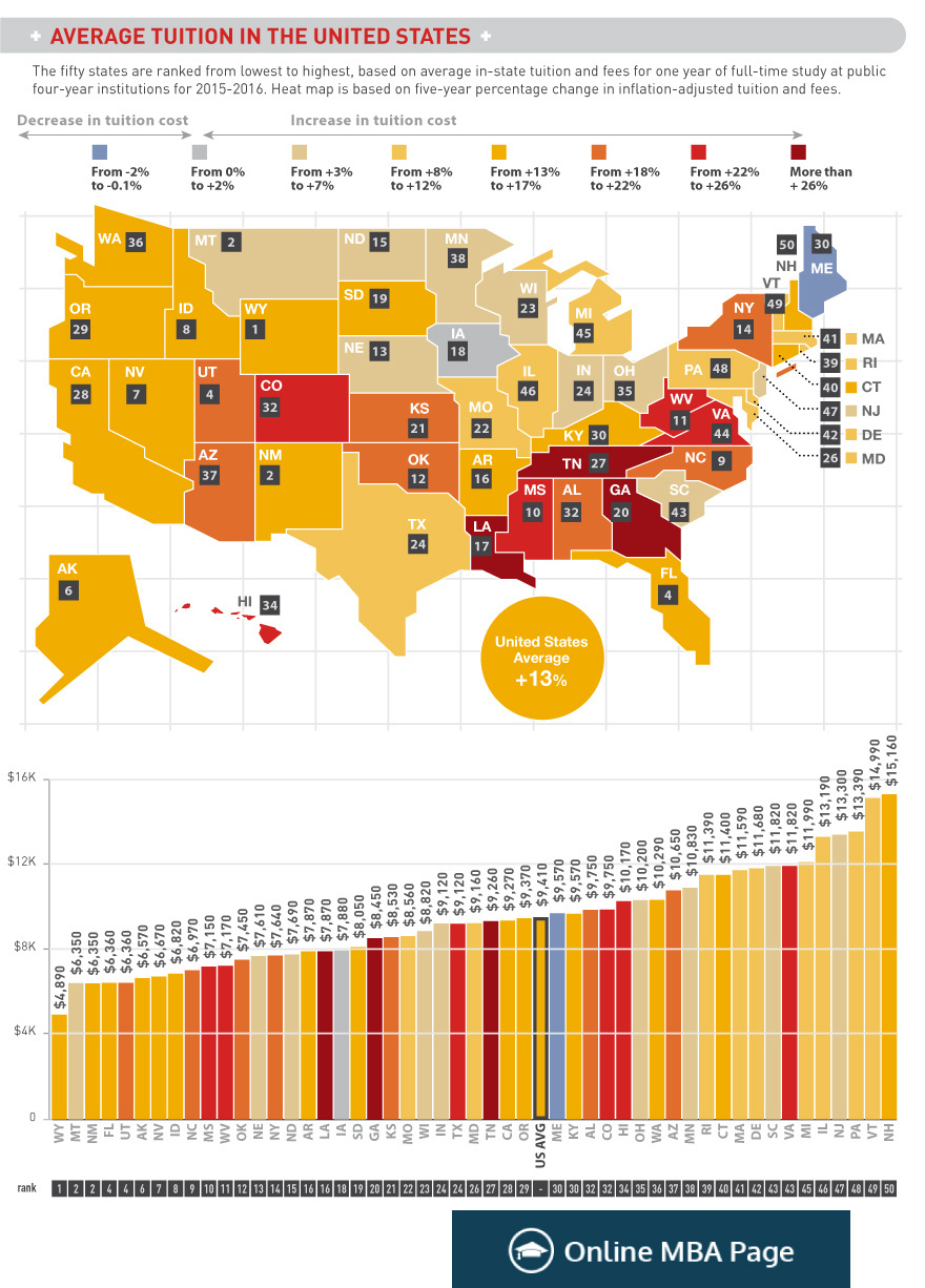
Here are the two visualizations in this week’s challenge (original source):
Data Wrangling
Let’s load the packages we’ll need, as described in the code comments below.
library(tidyverse) # It's TidyTuesday after all!## ── Attaching packages ────────────────────────────────────── tidyverse 1.2.1 ──## ✔ ggplot2 3.1.0 ✔ purrr 0.2.5
## ✔ tibble 1.4.2 ✔ dplyr 0.7.8
## ✔ tidyr 0.8.1 ✔ stringr 1.4.0
## ✔ readr 1.1.1 ✔ forcats 0.3.0## Warning: package 'stringr' was built under R version 3.5.2## ── Conflicts ───────────────────────────────────────── tidyverse_conflicts() ──
## ✖ dplyr::filter() masks stats::filter()
## ✖ dplyr::lag() masks stats::lag()library(readxl) # To read in Excel data the tidyverse way
library(viridis) # For awesome, accessible color palettes## Loading required package: viridisLiteLet’s read in the source data, which in this case is an Excel (.xlsx) file hosted on the TidyTuesday GitHub repo:
file_path <- "data/us_avg_tuition.xlsx"
r <- read_excel(file_path)
r
## # A tibble: 50 x 13
## State `2004-05` `2005-06` `2006-07` `2007-08` `2008-09` `2009-10`
## <chr> <dbl> <dbl> <dbl> <dbl> <dbl> <dbl>
## 1 Alabama 5683. 5841. 5753. 6008. 6475. 7189.
## 2 Alaska 4328. 4633. 4919. 5070. 5075. 5455.
## 3 Arizona 5138. 5416. 5481. 5682. 6058. 7263.
## 4 Arkansas 5772. 6082. 6232. 6415. 6417. 6627.
## 5 California 5286. 5528. 5335. 5672. 5898. 7259.
## 6 Colorado 4704. 5407. 5596. 6227. 6284. 6948.
## 7 Connecticut 7984. 8249. 8368. 8678. 8721. 9371.
## 8 Delaware 8353. 8611. 8682. 8946. 8995. 9987.
## 9 Florida 3848. 3924. 3888. 3879. 4150. 4783.
## 10 Georgia 4298. 4492. 4584. 4790. 4831. 5550.
## # ... with 40 more rows, and 6 more variables: `2010-11` <dbl>,
## # `2011-12` <dbl>, `2012-13` <dbl>, `2013-14` <dbl>, `2014-15` <dbl>,
## # `2015-16` <dbl>It seems we have a mostly clean but untidy dataset. I’ll first do some light cleaning by renaming State to state to follow the tidy style guide, and then by turning the column into a factor with levels corresponding to the two-letter U.S. state codes from the built-in datasets package. This will be more space-efficient than using full state names.
r <- r %>%
  rename(state = State) %>%
  mutate(state_abb = factor(state.abb))
r
## # A tibble: 50 x 14
## state `2004-05` `2005-06` `2006-07` `2007-08` `2008-09` `2009-10`
## <chr> <dbl> <dbl> <dbl> <dbl> <dbl> <dbl>
## 1 Alabama 5683. 5841. 5753. 6008. 6475. 7189.
## 2 Alaska 4328. 4633. 4919. 5070. 5075. 5455.
## 3 Arizona 5138. 5416. 5481. 5682. 6058. 7263.
## 4 Arkansas 5772. 6082. 6232. 6415. 6417. 6627.
## 5 California 5286. 5528. 5335. 5672. 5898. 7259.
## 6 Colorado 4704. 5407. 5596. 6227. 6284. 6948.
## 7 Connecticut 7984. 8249. 8368. 8678. 8721. 9371.
## 8 Delaware 8353. 8611. 8682. 8946. 8995. 9987.
## 9 Florida 3848. 3924. 3888. 3879. 4150. 4783.
## 10 Georgia 4298. 4492. 4584. 4790. 4831. 5550.
## # ... with 40 more rows, and 7 more variables: `2010-11` <dbl>,
## # `2011-12` <dbl>, `2012-13` <dbl>, `2013-14` <dbl>, `2014-15` <dbl>,
## # `2015-16` <dbl>, state_abb <fct>Now for the tidying. In this dataset, each value is an observation of the “average in-state tuition and fees for one year of full-time study at public institutions” for a given school year. But values belonging to different school years are spread out across columns, which violates tidy principles. We need to gather() these values and index them by year:
r %>%
  gather(year, tuitfee, `2004-05`:`2015-16`)
## # A tibble: 600 x 4
## state state_abb year tuitfee
## <chr> <fct> <chr> <dbl>
## 1 Alabama AL 2004-05 5683.
## 2 Alaska AK 2004-05 4328.
## 3 Arizona AZ 2004-05 5138.
## 4 Arkansas AR 2004-05 5772.
## 5 California CA 2004-05 5286.
## 6 Colorado CO 2004-05 4704.
## 7 Connecticut CT 2004-05 7984.
## 8 Delaware DE 2004-05 8353.
## 9 Florida FL 2004-05 3848.
## 10 Georgia GA 2004-05 4298.
## # ... with 590 more rowsAh, but wait! For the visualizations, we’ll ultimately need to have the “five-year percentage change in inflation-adjusted tuition and fees” for 2015-16. That’ll be a little easier to calculate now while the data is in wide format.
# Calculate the most recent 5-year % change in tuition and fees
r <- r %>%
  mutate(tuitfee_5yr_pct_chg = (`2015-16` - `2010-11`) / `2010-11` * 100) %>%
  gather(year, tuitfee, `2004-05`:`2015-16`) %>%
  select(state_abb, year, tuitfee, tuitfee_5yr_pct_chg) %>%
  filter(year == "2015-16")
r
## # A tibble: 50 x 4
## state_abb year tuitfee tuitfee_5yr_pct_chg
## <fct> <chr> <dbl> <dbl>
## 1 AL 2015-16 9751. 20.8
## 2 AK 2015-16 6571. 14.1
## 3 AZ 2015-16 10646. 20.4
## 4 AR 2015-16 7867. 14.0
## 5 CA 2015-16 9270. 13.1
## 6 CO 2015-16 9748. 25.8
## 7 CT 2015-16 11397. 16.0
## 8 DE 2015-16 11676. 10.8
## 9 FL 2015-16 6360. 15.4
## 10 GA 2015-16 8447. 31.4
## # ... with 40 more rowsNow that’s a tidy data frame!
Visualization
We’re ready to start visualizing. I’ll begin with the bar chart at the bottom of the example since I don’t know as much about creating cloropleth maps. I’m going to redo this bar chart as a Cleveland-style dot plot because the latter provides the same information with less “ink” and simplifies the perceptual decoding task.
r %>%
  ggplot() +
  geom_point(aes(color = tuitfee_5yr_pct_chg,
                 x = fct_reorder(state_abb, tuitfee),
                 y = tuitfee)) +
  ggtitle("Average tuition and fees in the United States",
          subtitle = "Average tuition and fees for one year of full-time study at public institutions, 2015-16") +
  xlab("State") +
  ylab("\nAverage Total Tuition and Fees") +
  labs(color = "5-Yr % Chg\n",
       caption = "Source: https://bit.ly/2EeBXpf") +
  scale_y_continuous(labels = scales::dollar) +
  scale_color_viridis() +
  coord_flip() +
  theme_minimal()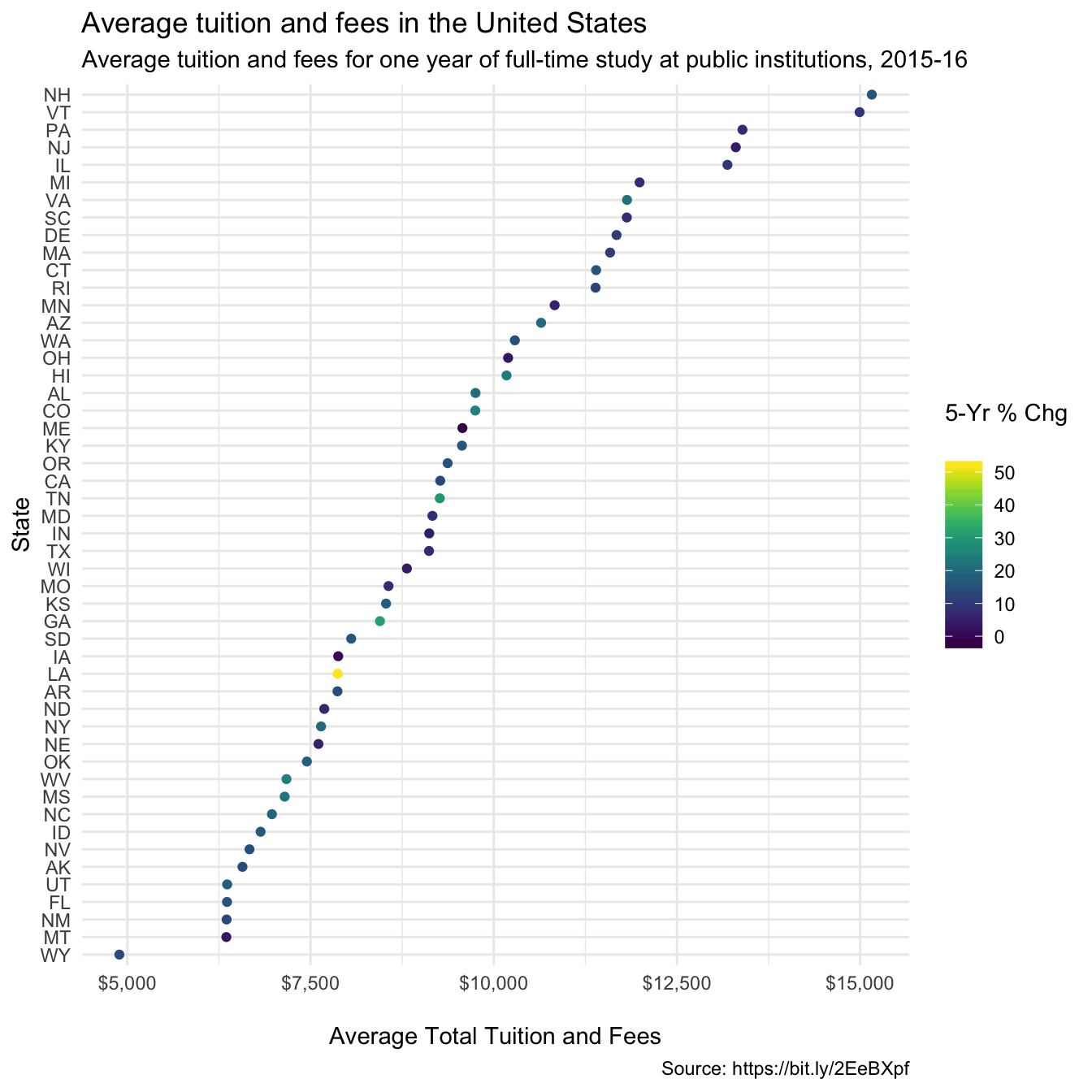
Summary
Time is almost up, so here are some quick thoughts about what I’d do next if I had more time:
- Modify the color scale to use a divergent scale centered at 0, so it’s more obvious when a state’s tuition has gone down versus up
- Add a reference line or distinct geom to show the national average
- Adjust the
stateaxis so the state labels are more legible - Find a way to show more of the raw data – what if 2010-11 was an awkward year with special causes at play?
- Learn how to create the map visualization
What I learned from this challenge:
- Four hours seemed like a lot, but it’s not when you have to look up a lot of things online and write about it
- Writing out the coding steps and rendering the results in an R Markdown document was fun and helped me figure out what I needed to do next
- I have a lot to learn, especially when it comes to tweaking ggplot2 figures. To me, this is the most exciting part.
I hope to return to these lists and update the visualization in a later post. In the meantime, if you have any thoughts you’d like to share, I’d love to hear from you in the comments below or on Twitter.
Many thanks to the R4DS community for setting up the first of what I hope will be many future #TidyTuesday challenges!